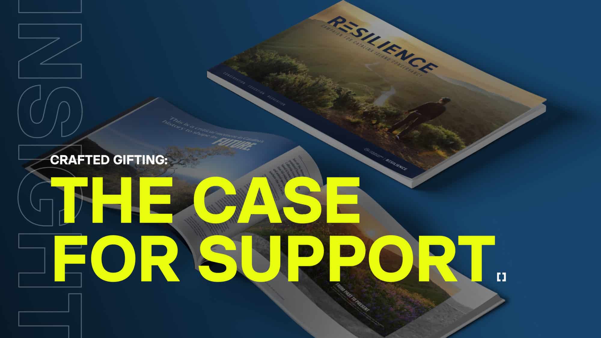
With the world shifting to digital, it’s easy to assume that printed cases for support are not as relevant to an impactful campaign. We disagree.
We’ve put together a three examples that explore the power of the printed case. We believe form matters as much as function. While there are certainly situations where a digital case is appropriate, printed cases offer a unique, tactile connection to an institution and its cause. They serve as a physical reminder of impact, sparking deeper conversations and opening the door for more personalized donor relationships.
CIC (Catalina Island Conservancy) Resilience
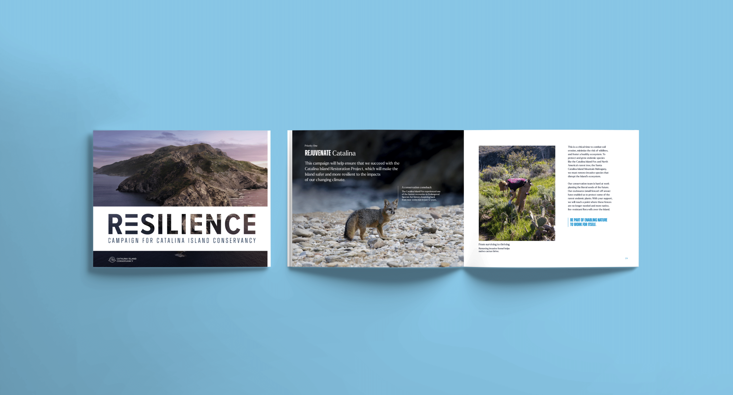
We’re kicking off by looking at our work for the Catalina Island Conservancy’s bold $50 million Resilience campaign to restore fragile habitats and safeguard wildlife.
Instead of a standard brochure, we designed their case for support as a nature journal. This choice brought the island to life, allowing donors to feel deeply connected to the cause, no matter where they were. Additionally, it transformed a standard presentation into a deeply immersive experience, making the campaign feel uniquely personal to every donor. By engaging their senses, this memorable artifact did far more than just share information. It made donors feel like true partners in the mission, naturally inspiring a higher level of commitment and giving.
NCHF Forward for Generations Board Book
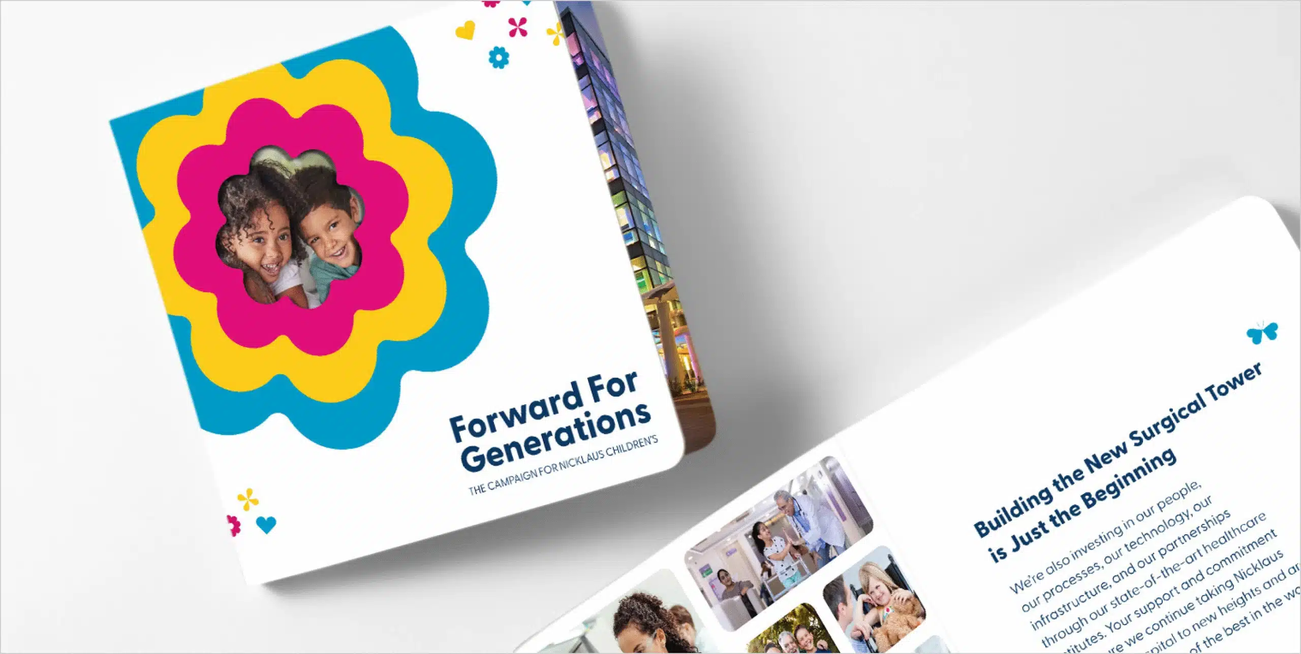
Next up: Forward for Generations, the campaign Parisleaf created in partnership with Nicklaus Children’s Health Care Foundation. This transformative initiative supports cutting-edge pediatric treatments, surgical innovation, breakthrough research, and world-class specialists.
For a monumental campaign to raise funds for our most precious resource, we needed a case for support that truly reflected the cause. When fundraising conversations turn to data and analytics, the human element can easily get lost. We can forget the wonder, innocence, and potential of the children we are fighting to protect.
We used the case for support to bring that focus back. By creating the piece as a children’s board book, we gave donors a visceral reminder of who this campaign is for, while the messaging inside articulated the why.
DU Field Guide
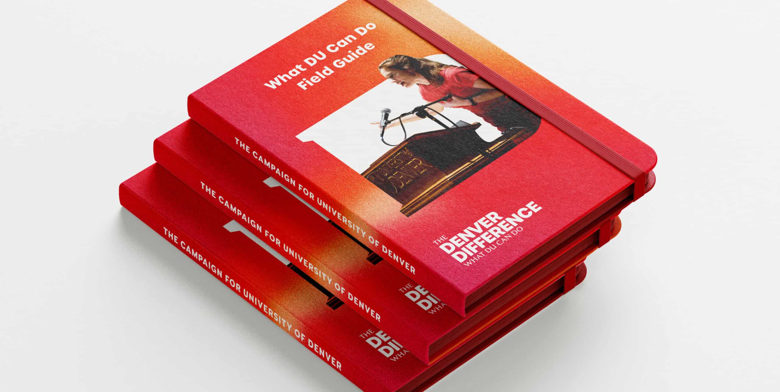
For the final example, we’re exploring the campaign we created with the University of Denver. The name of this campaign, The Denver Difference, centered around the “wildly authentic” Rocky Mountain roots that are at the core of the DU experience.
To drive that home, we designed their case for support as a field guide. This choice brought the exploratory nature of the university and the adventure of the region to life. It also served as a natural conversation piece. Data shows that friends of donors are highly likely to become supporters themselves, making a coffee-table artifact the perfect catalyst to spark dialogue and inspire giving.
When form elevates function, the giving follows.