Campaign for Nicklaus Children’s Hospital
What we did
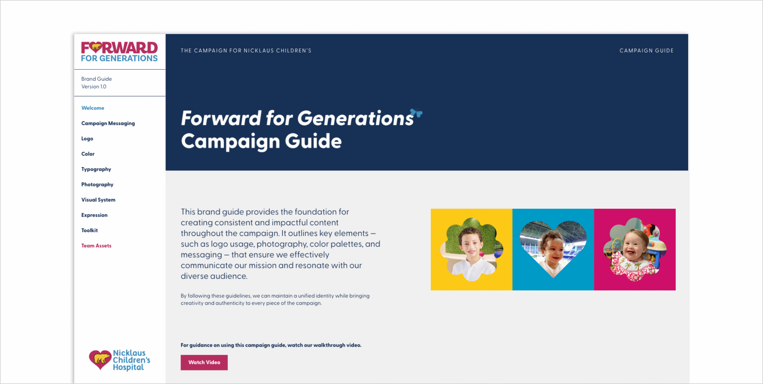
- Campaign Brand System
- Campaign Messaging
- Campaign Naming
- Campaign Visual Identity
- Discovery
- Research & Strategy
Moving a mission forward.
Nicklaus Children’s Hospital has been a lifeline for South Florida families for over 70 years. As the region grows and the healthcare needs of children become more complex, the hospital’s Foundation saw the need for something bold. Something lasting.
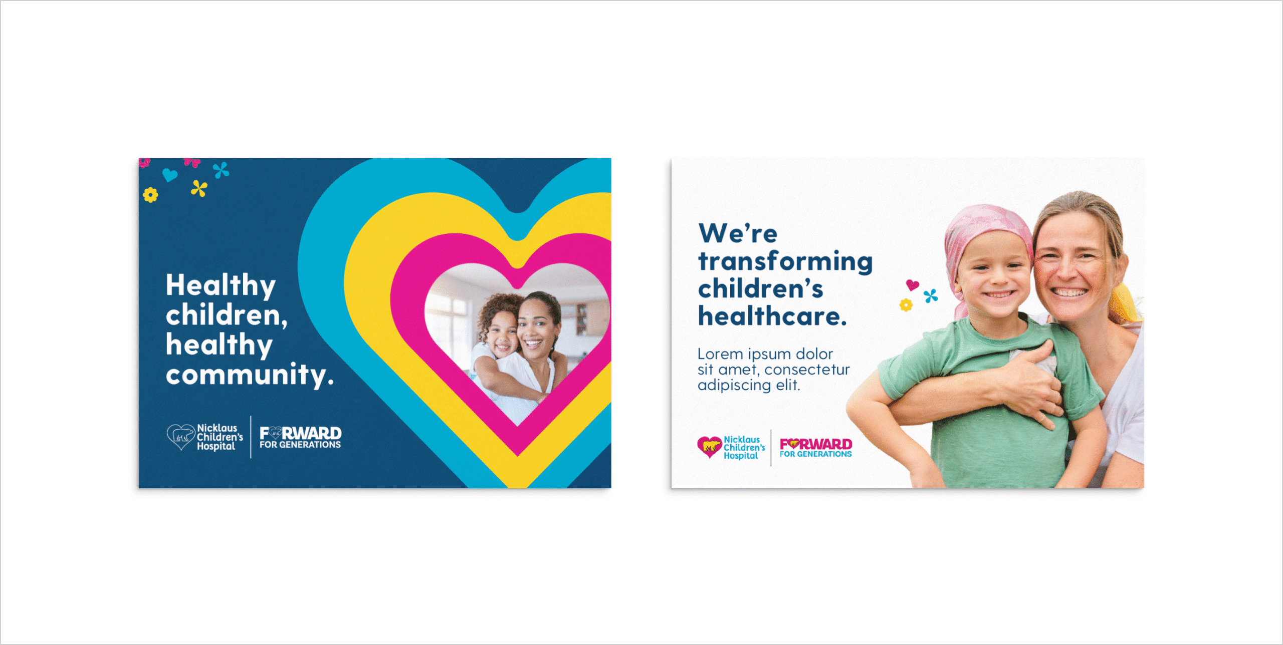
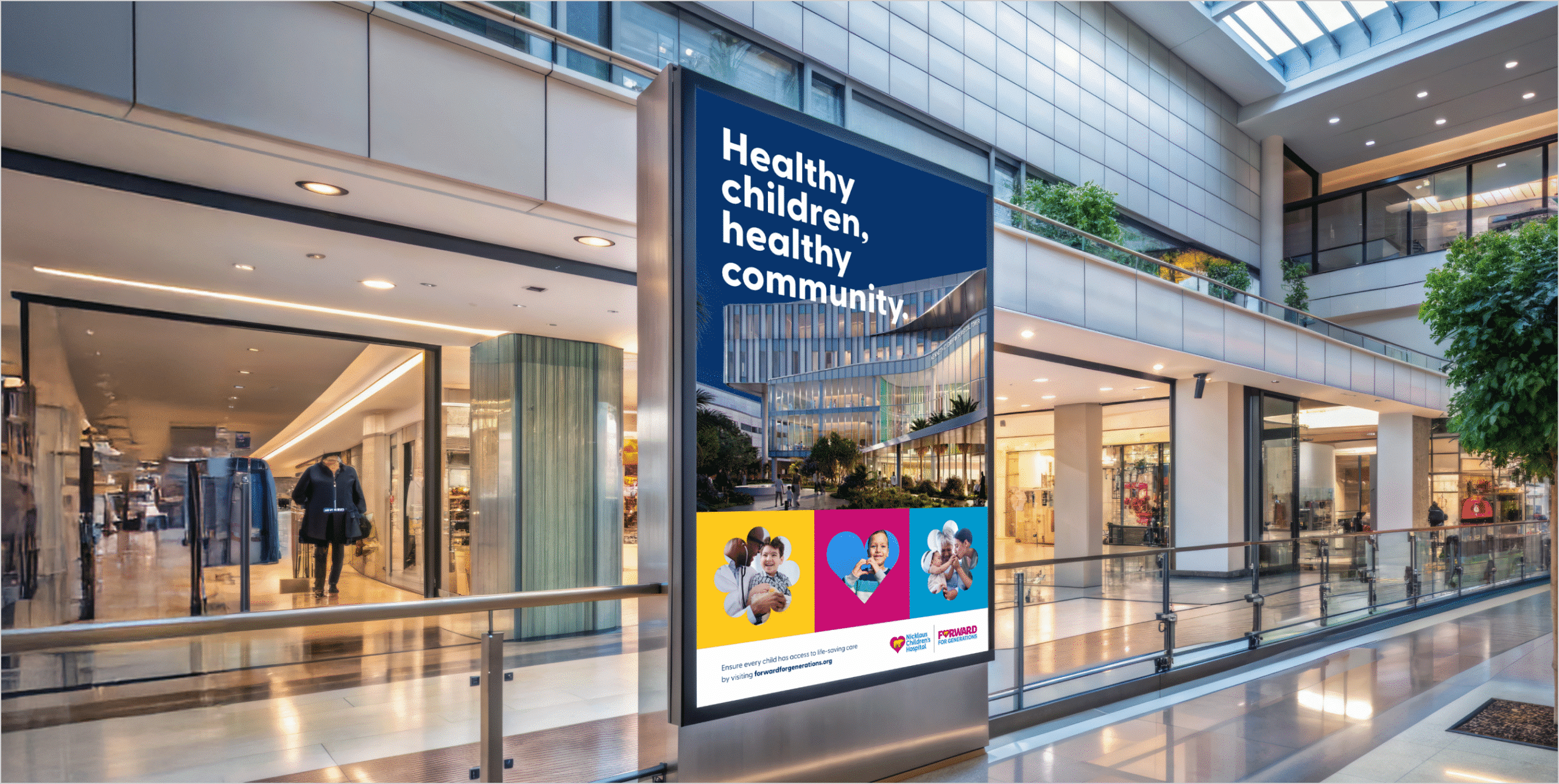
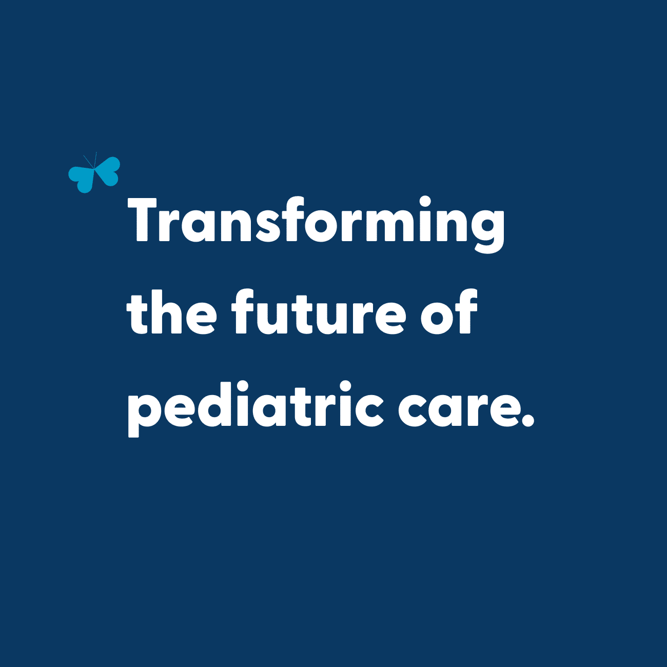
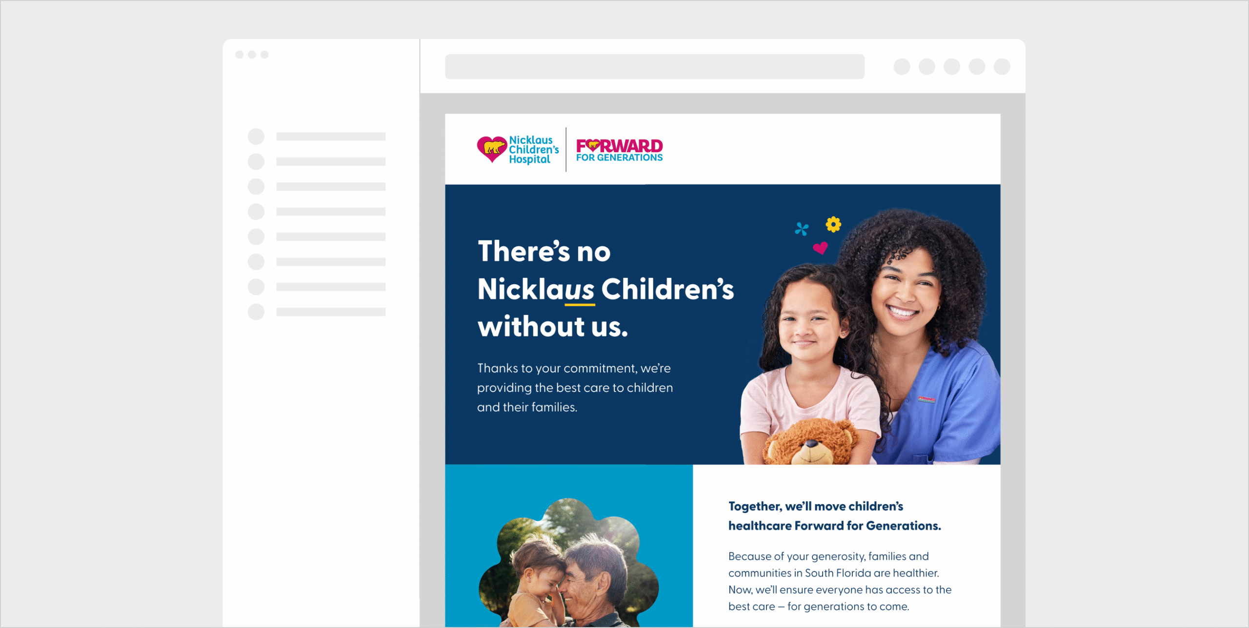
Forward for Generations is the most ambitious fundraising campaign in the hospital’s history. It’s a transformative investment in the future of pediatric care, generating support for cutting-edge treatments, surgical innovation, breakthrough research, and the recruitment of world-class specialists. It helped construct a state of the art surgical tower on Nicklaus Children’s main campus; however, this campaign is about more than modern facilities. It’s about strengthening the health of the communities it serves for generations to come.

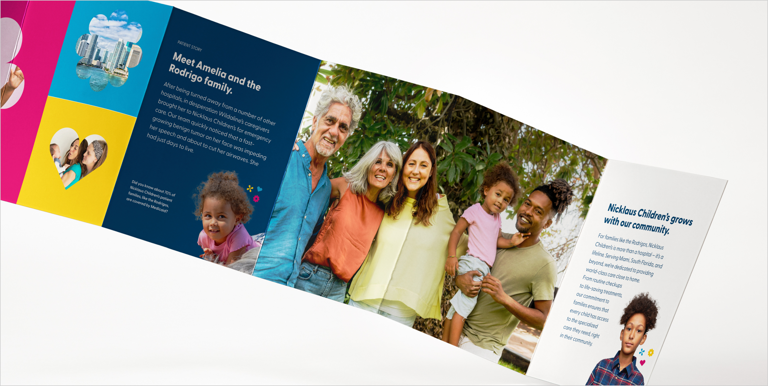
This campaign demonstrates how philanthropy is rooted in legacy. Many of the donors were once patient families themselves, now paying it forward to ensure future generations have access to the same exceptional care. The brand needed to strike the right balance: joyful but not childish, urgent but not alarming, and grounded in the belief that healthy kids are the foundation of healthy communities.


Parisleaf partnered with the Foundation to create a campaign identity that built on the brand ethos of Nicklaus Children’s and could also grow over the course of the campaign. Forward for Generations asked people to think long-term, act today, and give generously—because the future of care depends on what we build together, today.


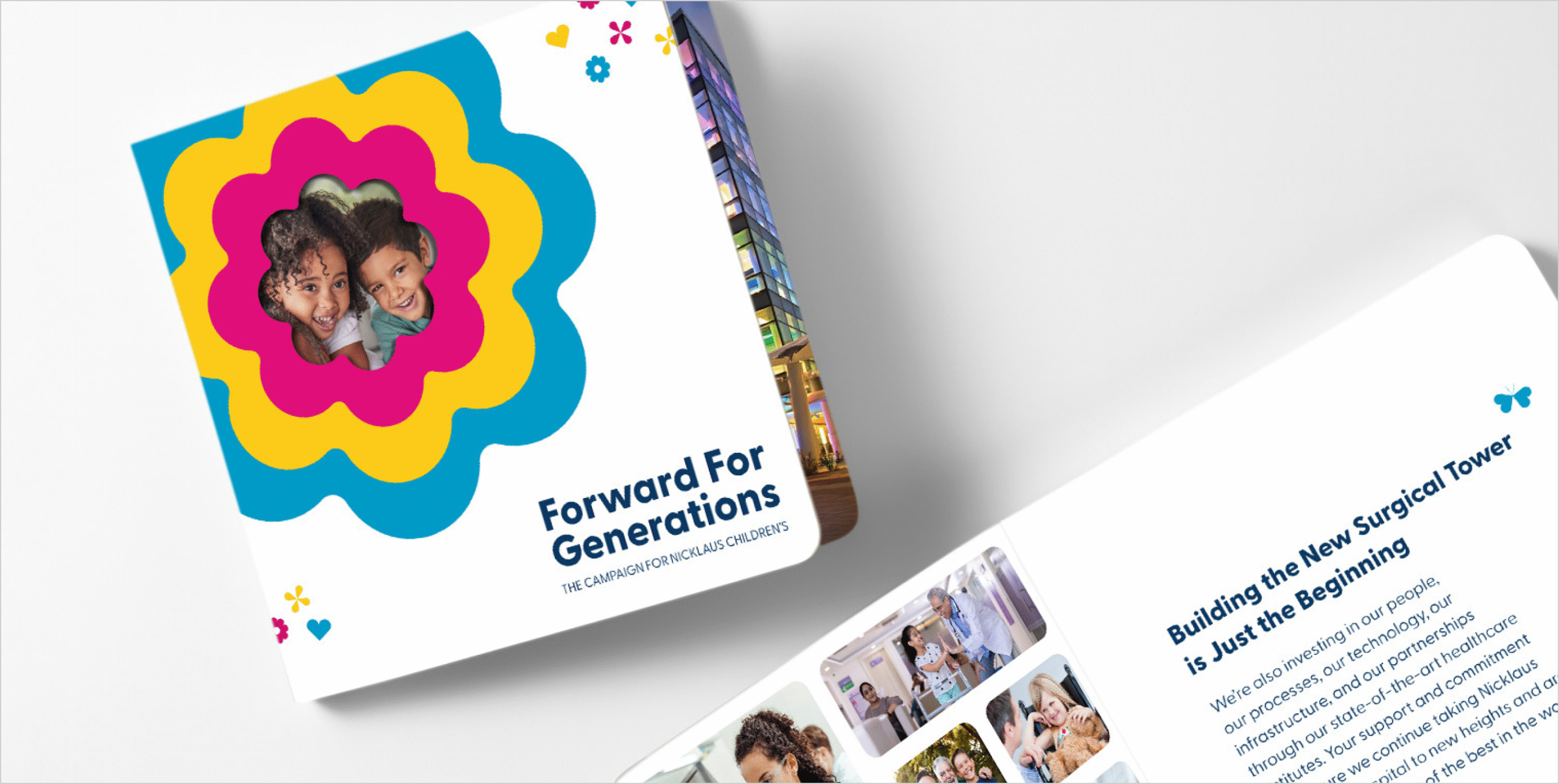


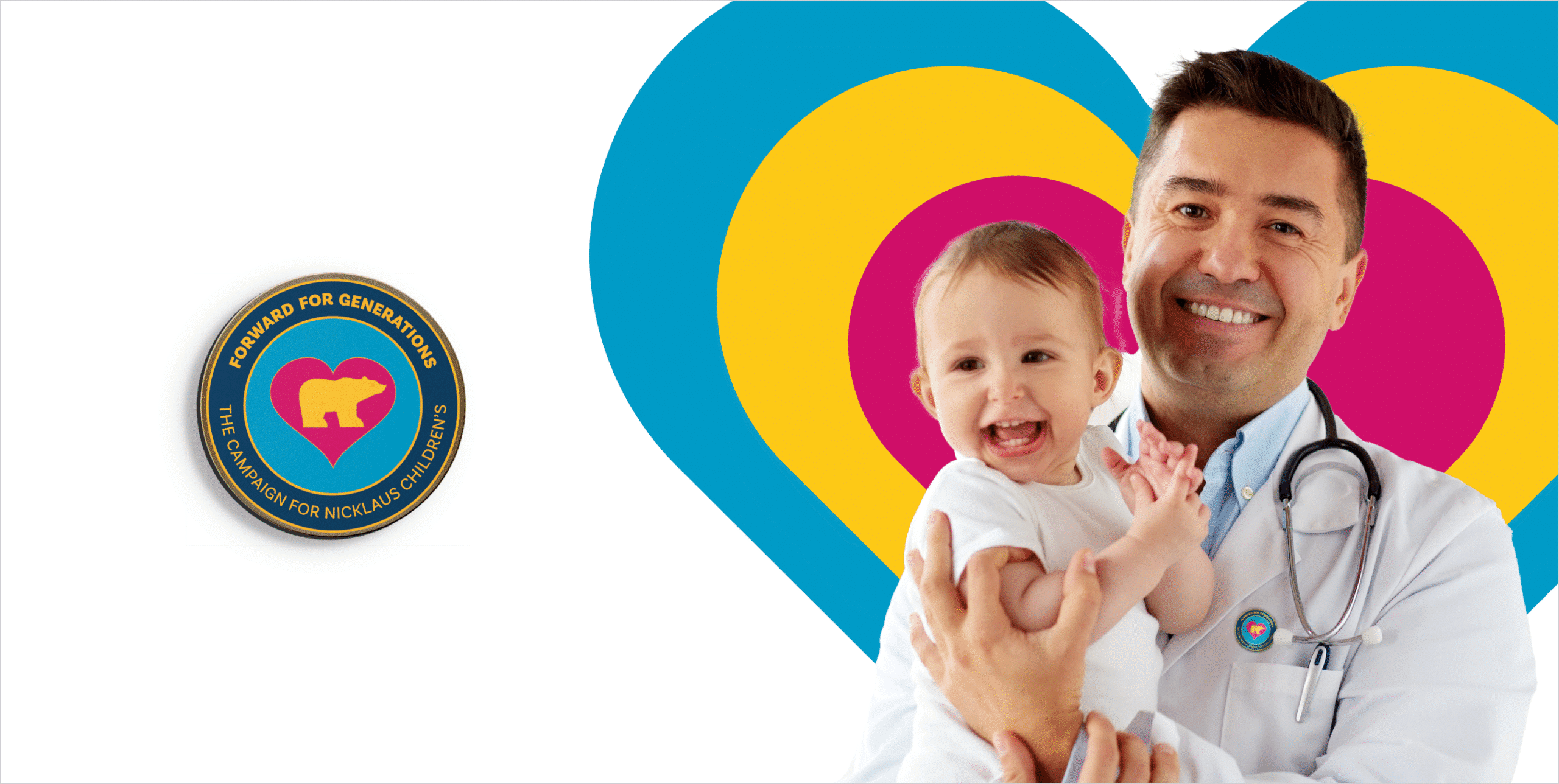
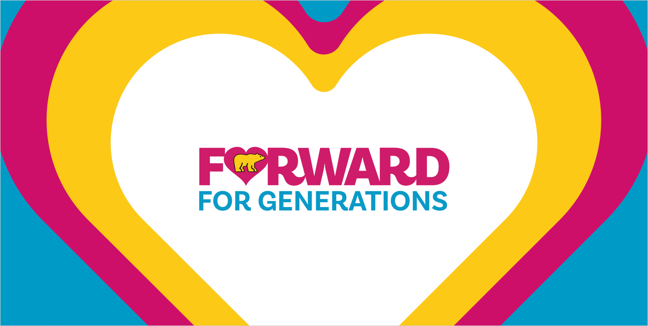
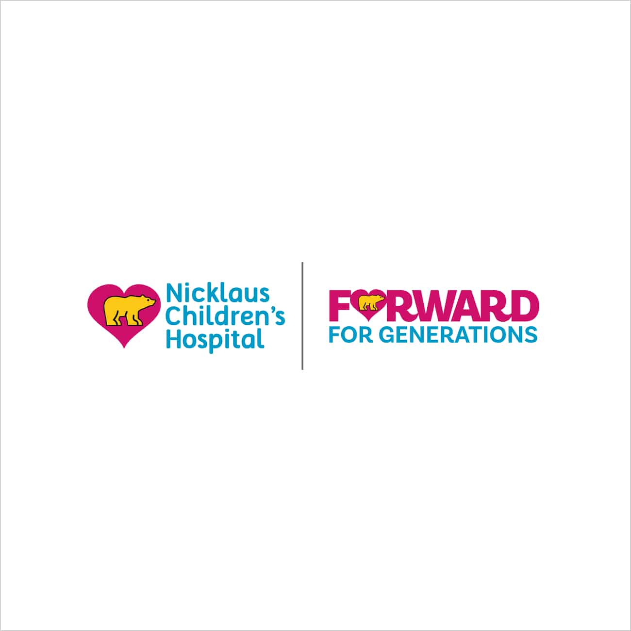
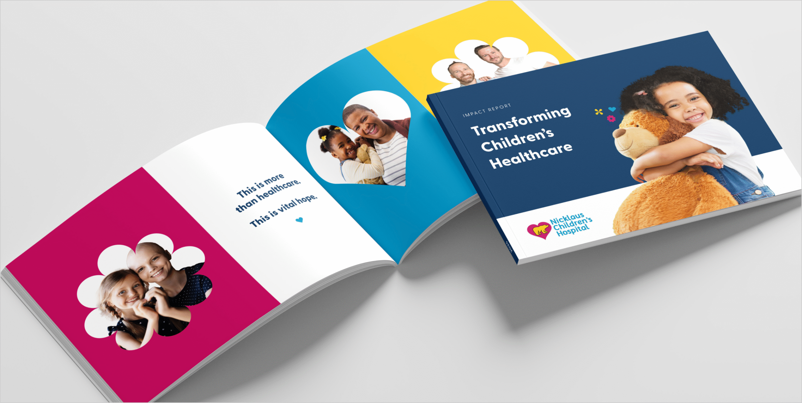
We thought a lot about how the campaign could get across the idea of progressing forward. This is where the campaign name came to be: Forward For Generations The heart became a metaphor for love throughout this brand and we began to connect the arrow and heart together, becoming a clover-like shape. Once we began rotating it, petals began to form and then eventually we were able to get a kaleidoscopic effect. These elements give a colorful and vibrant energy to bring to the future of the healthcare community and beyond. And so the visual system began to take shape.
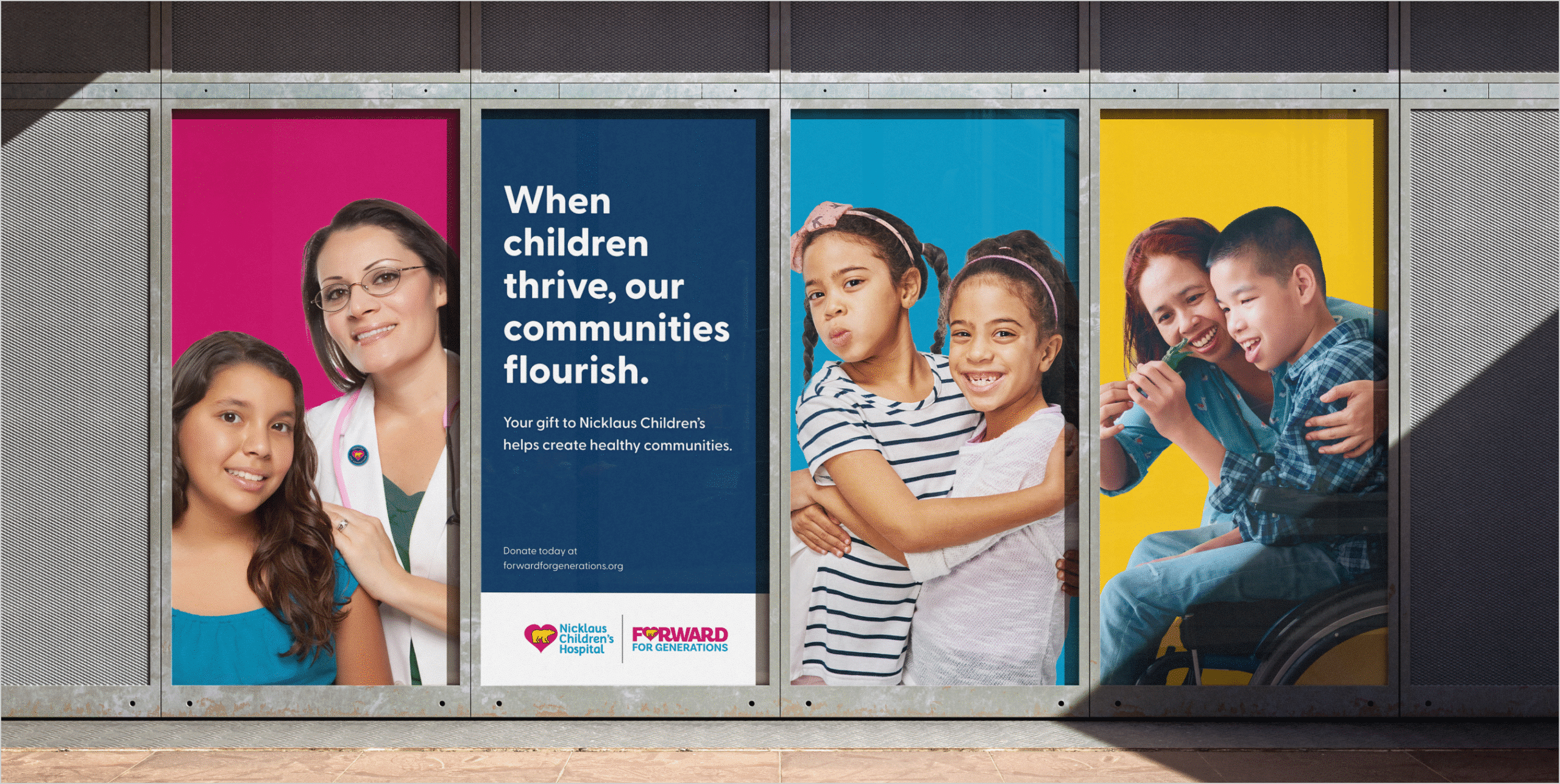
This is the most important and comprehensive campaign Nicklaus Children’s has ever embarked on. Their goal is to be the best pediatric hospital in the Southeast and a global destination for children’s medical specialties. As one of the remaining standalone pediatric hospitals in the U.S. we touch the lives of nearly one million children each year.
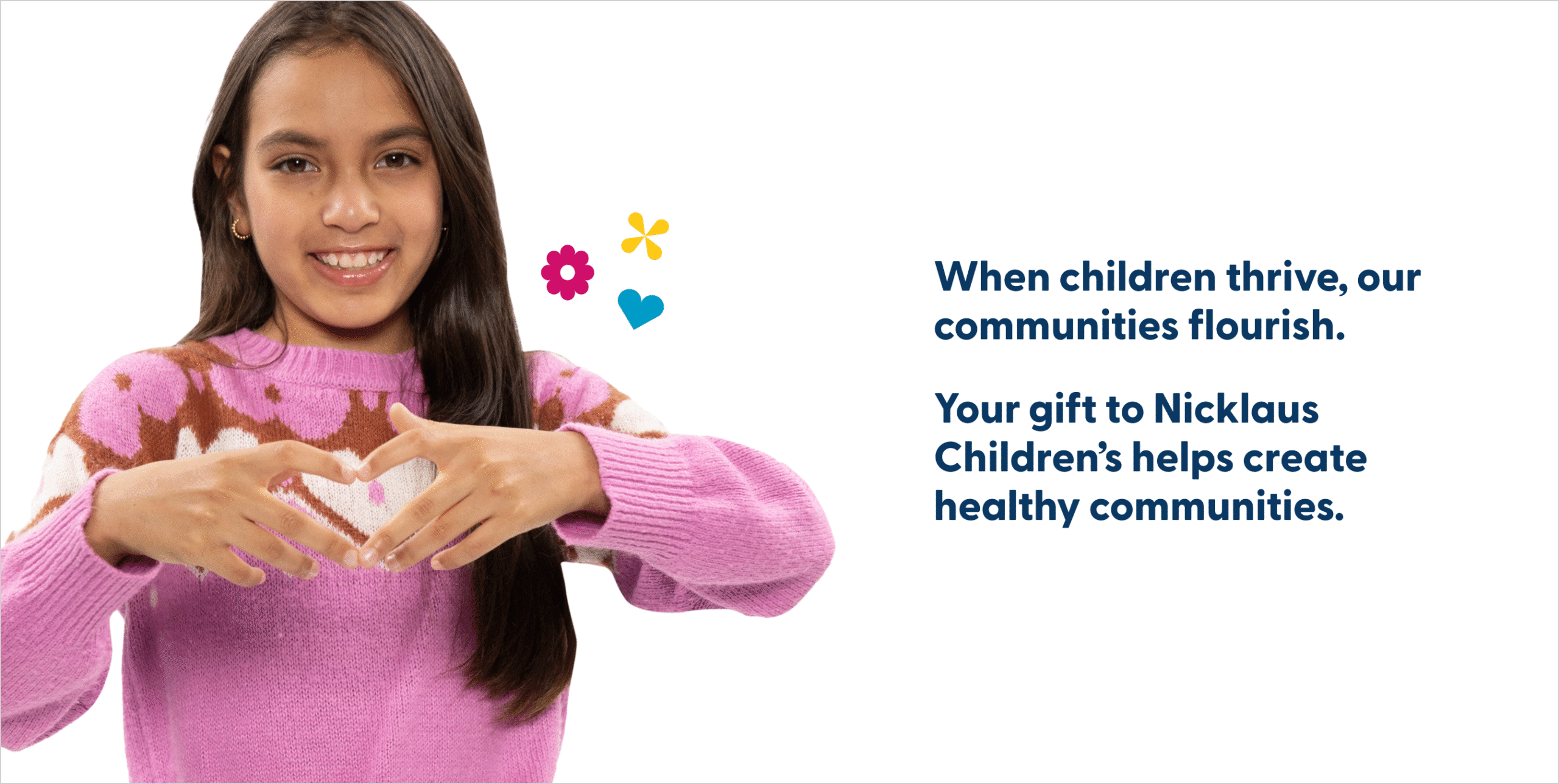
This campaign is much more than a new surgical tower; It’s about dedication to reaching more kids, both near and far. As Nicklaus Children’s pushes the boundaries of healthcare they are transforming what a children’s hospital can truly be, for generations to come.

