Process Review is a new series of articles that provide an in-depth look at Parisleaf’s creative process. For select projects, we will offer the inside scoop from beginning to end, reflecting on lessons learned and challenges met in the pursuit of creative solutions that drive business.
No brick without purpose
In the summer of 2017, we sat down with several members of the leadership team at then-named D.E. Scorpio Corporation to talk about their website and how the user experience might be improved. The conversation quickly grew from digital presence to brand strategy: they didn’t have one. CEO Domenic Scorpio had many ideas about where the company was headed and why, but struggled to articulate that purpose and ambition to his team and potential clients. The company’s reputation was solid. But from the outside, there was no way to tell what set them apart. In an industry where everyone with a hardhat and a hammer talks about quality, integrity, and safety, they needed to dig deeper and discover what truly makes them unique – and why it matters.
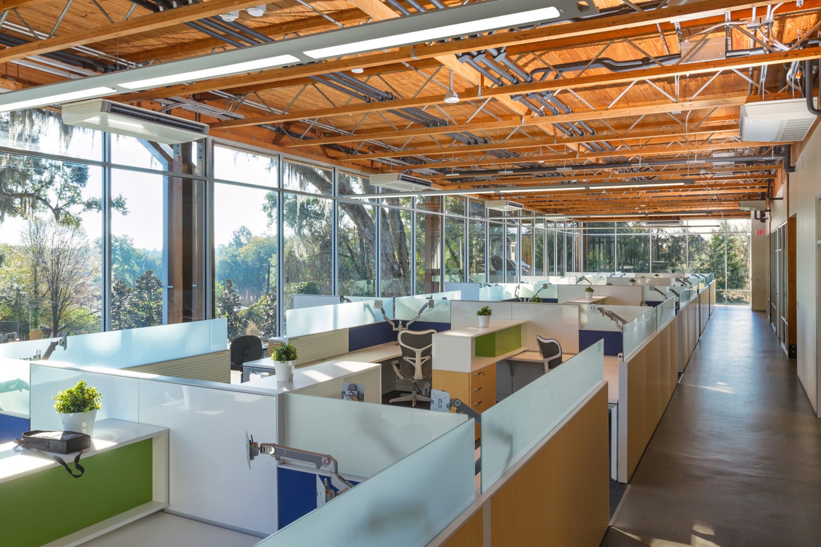
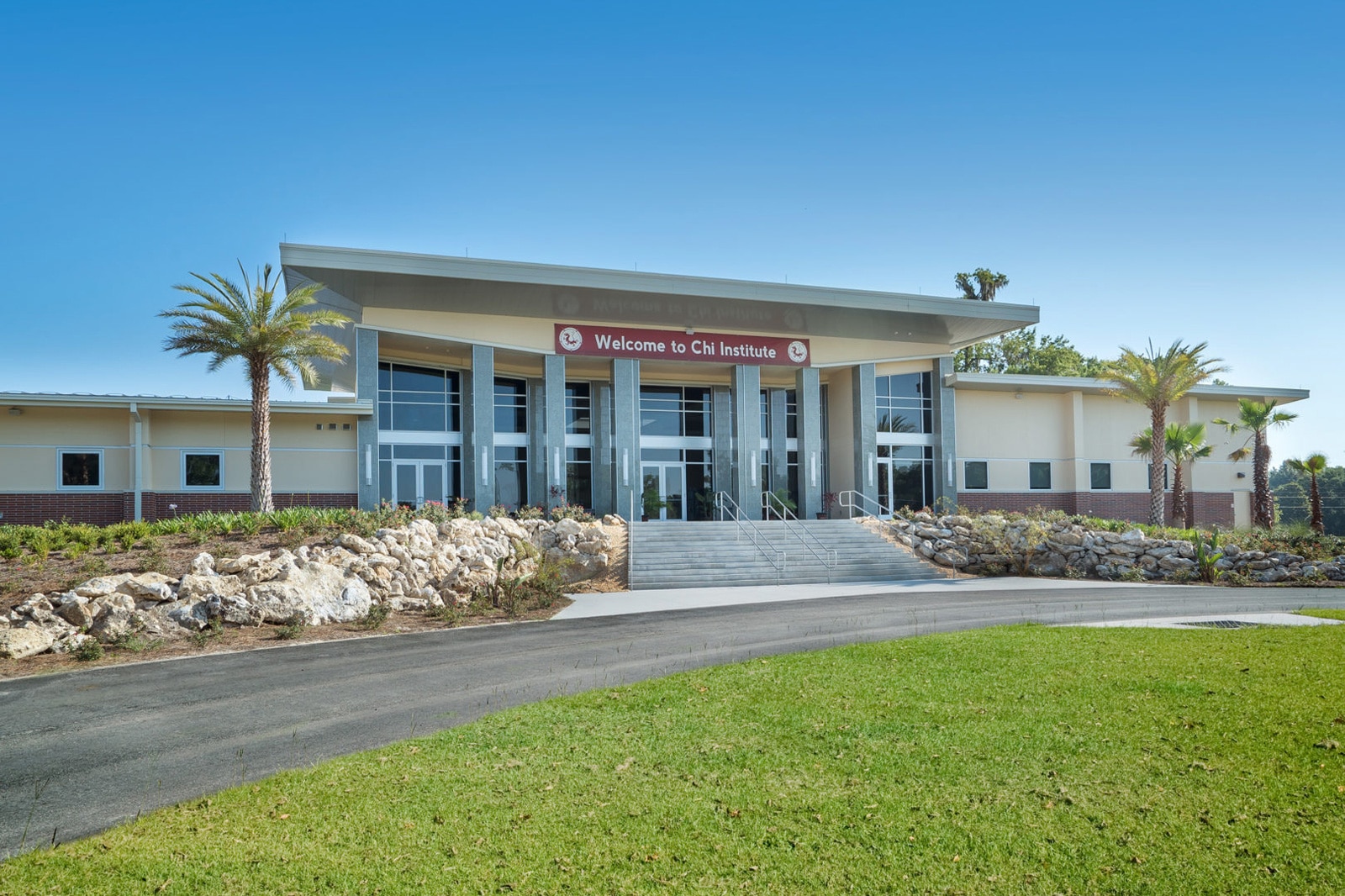
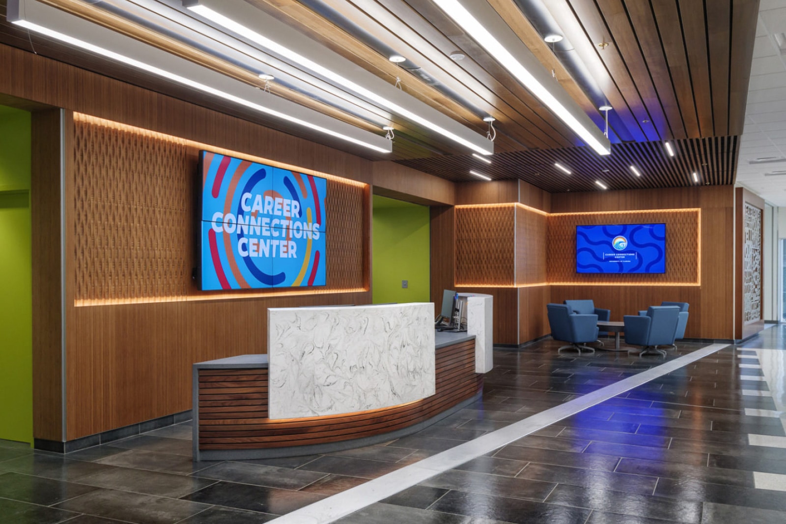
A few highlights from Scorpio’s portfolio of building projects
When interviewing dozens of employees, clients, and contractors, we heard how the company sees itself and how it is perceived externally. The company and Domenic were commonly viewed as inseparable. This perception had been good for client relationships but could hinder the development of self-reliant leaders among their team. And while Domenic had long been in the habit of considering how each building project might impact its community, almost all of their employees had to be pressed hard to think about the end-users of their buildings, and beyond that to their impact on the broader community in Gainesville and wherever else they build. We wondered: how might a refocused brand strategy address these issues and empower everyone on their team to speak the same language?
Here’s a small sampling of the more promising quotes from our interviews:
“Connection to architecture is necessary for builders. I see other builders banging their heads against the wall when working with architects because they don’t speak the same language or see things the same way.”
“We’re not curing cancer, but I can know I helped build the lab that gave someone the resources to cure cancer.”
“The design is much more likely to get built as we envision it when we work with Scorpio.”
We heard about Domenic’s and the team’s desire to rebel against the industry’s status quo and create a healthy culture that differs from past experiences. We heard about the desire to be big players in North-Central Florida and beyond. And from every single person we spoke to, we heard about unwavering commitment to the customer.
Well and good. Scorpio are challengers, but to what end? That’s what we needed to articulate. They needed a magnetic purpose statement that could serve as a public call to action as well as the foundation for internal guidance. And we knew their ambition would only be compelling if it exceeds what a single lifetime can achieve.
The quality of Scorpio’s work is consistently high, but excellence in any field is never a real differentiator as far as brand positioning is concerned. What really stood to make Scorpio unique is a community-centered approach. This mindset already existed in its leadership team. They simply needed us to help them package it for public communication and, most importantly, in a format that their team could internalize. By bringing human impact to the forefront of their communications, employees and clients alike would be frequently reminded of what it looks like when Scorpio’s purpose is put to work.
So why does Scorpio exist?
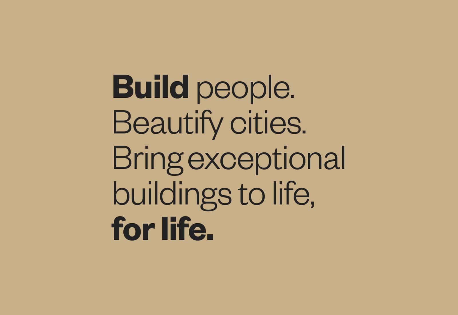
We summarized their big idea in three simple words: community-centered construction – and wrapped them within a handful of sentences that can be used together or separately.
Scorpio is a devoted and seasoned team of construction professionals who build to enliven communities and beautify cities.
People need buildings that frame their lives. Owners need return on investment. We deliver both through dedication to detail and holistic responsibility for your budget. And when you work with us, you’ll be treated with care and respect – like family.
We call this approach, community-centered construction.
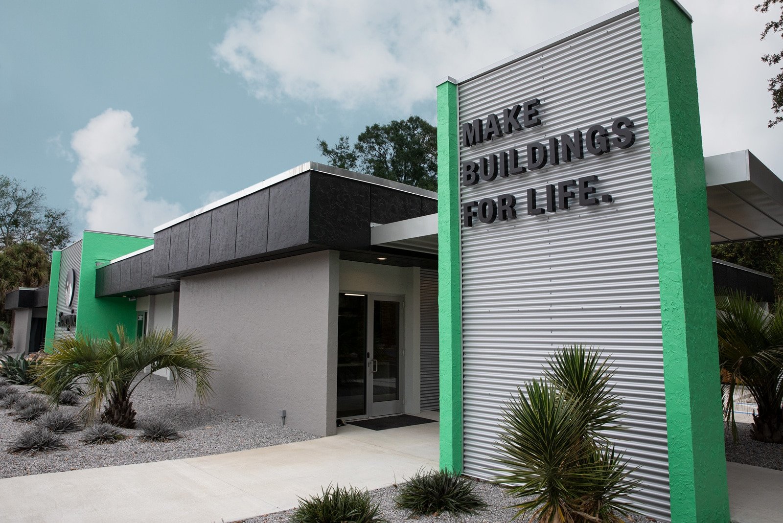
Let’s bring your building to life, for life.
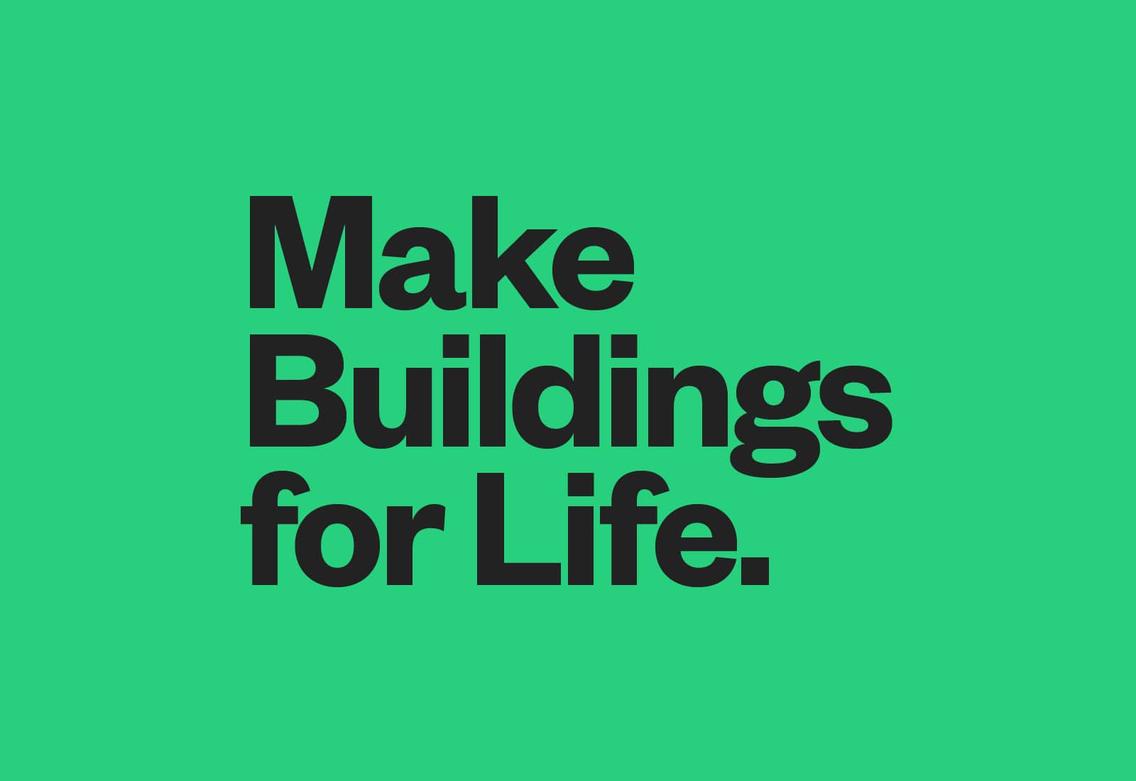
This statement led quite naturally to a powerful new tagline:
During discovery, we heard that very few people referred to them as “D.E. Scorpio Corporation.” The name on the street is Scorpio. Period. End of story. We embraced this finding in the name and logotype. Scorpio’s calm confidence and unwavering focus on quality were embodied in a logomark that is both expansive and tightly constructed. Depending on how you look at it, the logomark displays a dual representation of mountain peaks and the uppermost corners of buildings. We lovingly called this symbol Mount St. Building.
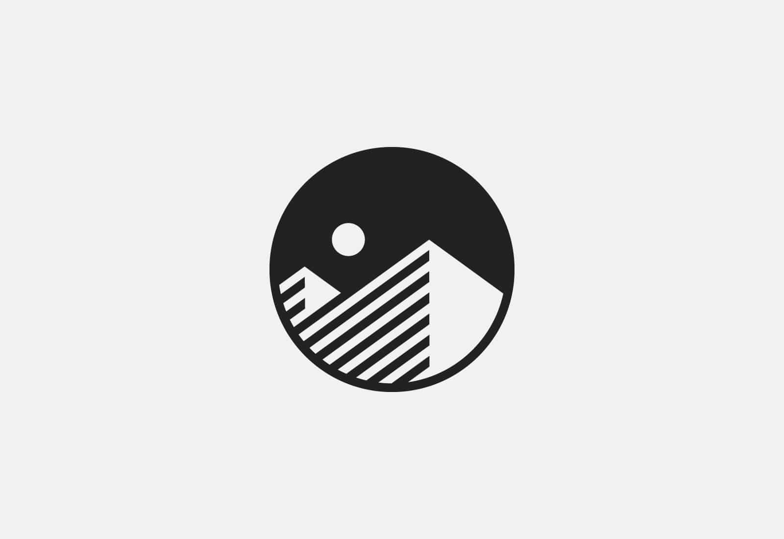
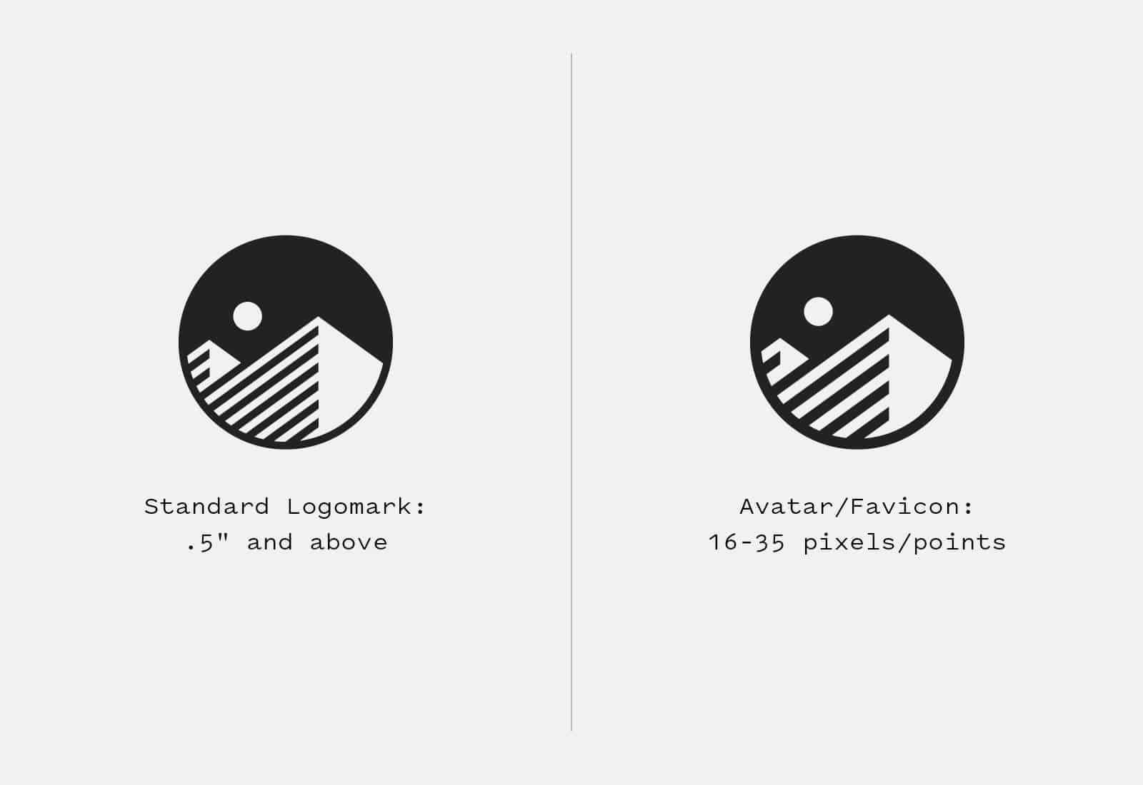
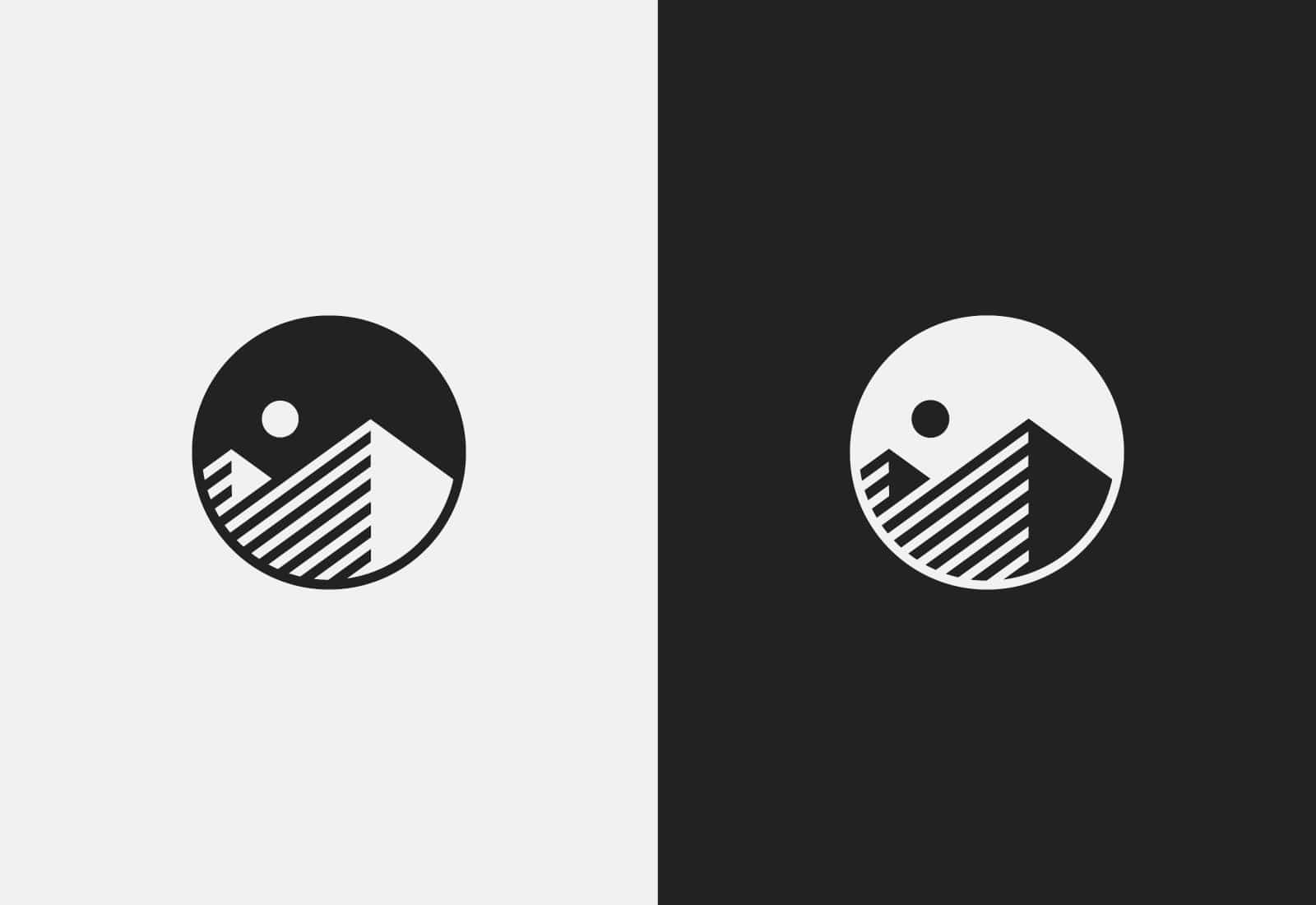
1: Are those buildings? Are they mountains? Yes. 2: Two optical versions for clarity at any size 3: Night and day, day and night
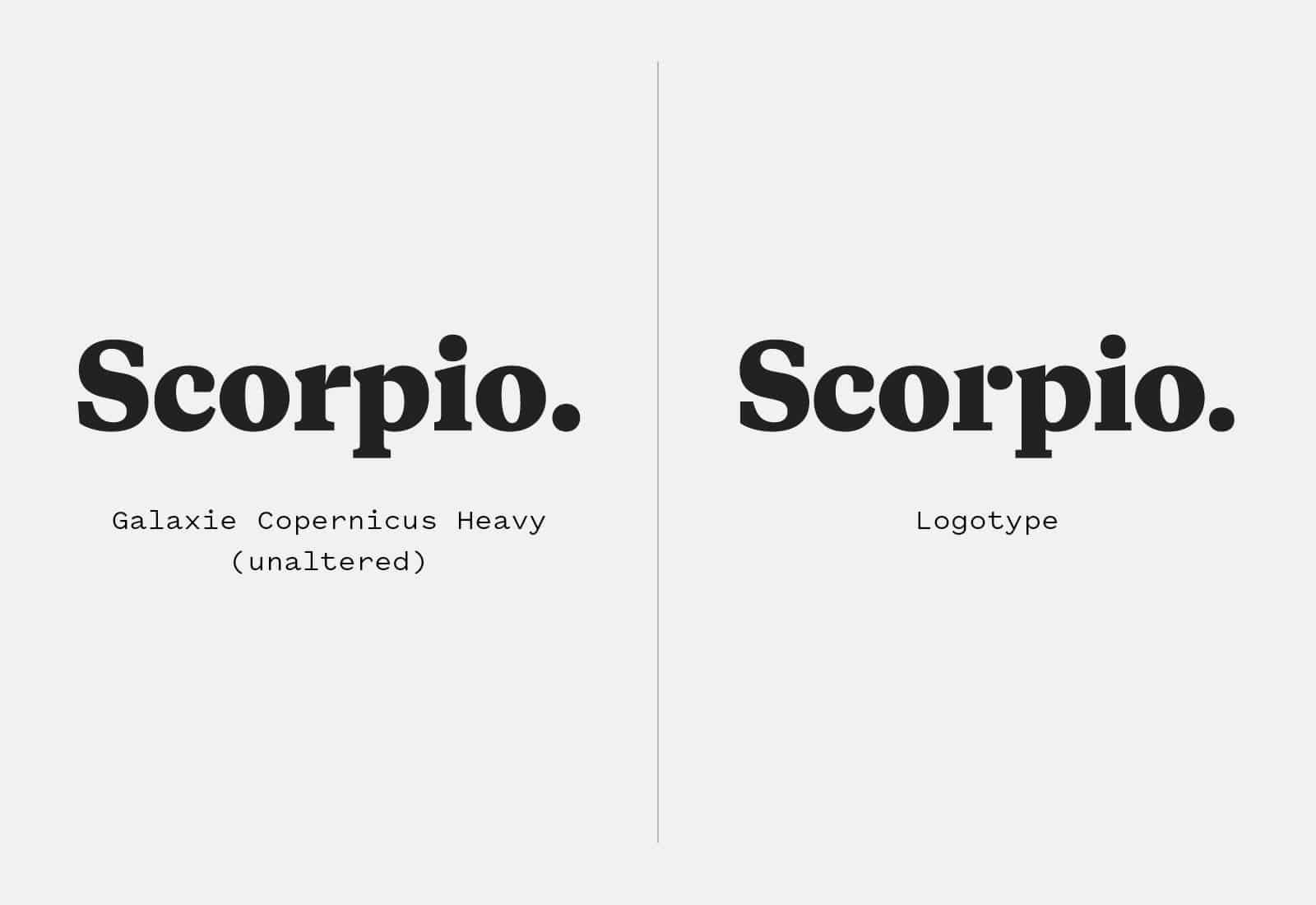
For my fellow type nerds, Scorpio’s logotype is a customization of Galaxie Copernicus, a contemporary typeface with Renaissance roots. Every letter but c and o were altered to create a sharper, more distinctive look. The rectangular serifs lost their curved transitions, the triangular serifs were sharpened, and the shoulder of r became a floating dot that echoes the other two dots in the name.
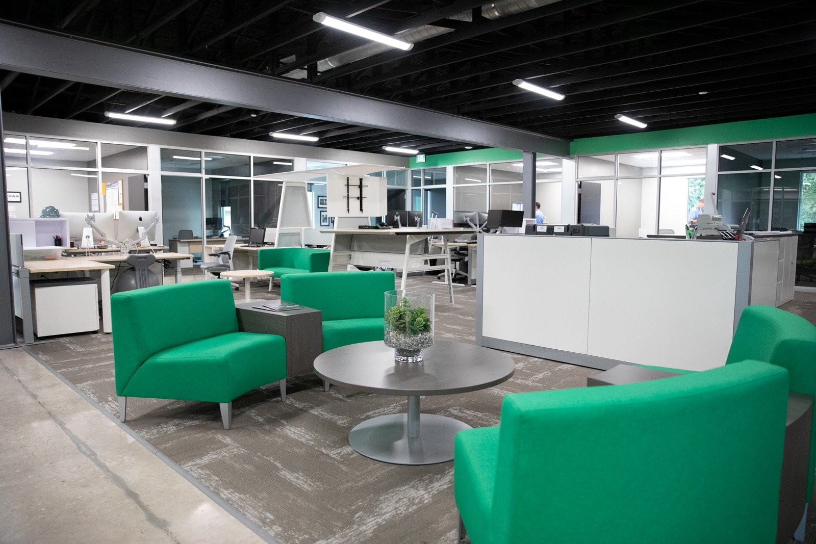
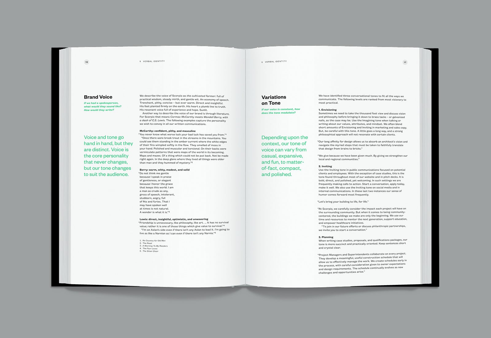
Quiet and loud. Dark and light. This visual identity is a study in contrast, with abundant white space balanced by rich blacks. A bright, hopeful green replaces the previous sagey color. Steel gray and khaki ground the palette, with touches of copper adding warmth and sophistication to their office space.
The real glue in this system is typography. We made exclusive use of Founders Grotesk, a comprehensive, sans serif font family that features size-specific variations and multiple widths. The Founders family is a kind of sans serif called Grotesque and was inspired by several early 20th century typefaces. Grotesques from that era are more idiosyncratic and workmanlike than later, more rational designs like Helvetica. Founders gives a warm, practical, and assured tone to all Scorpio communications.
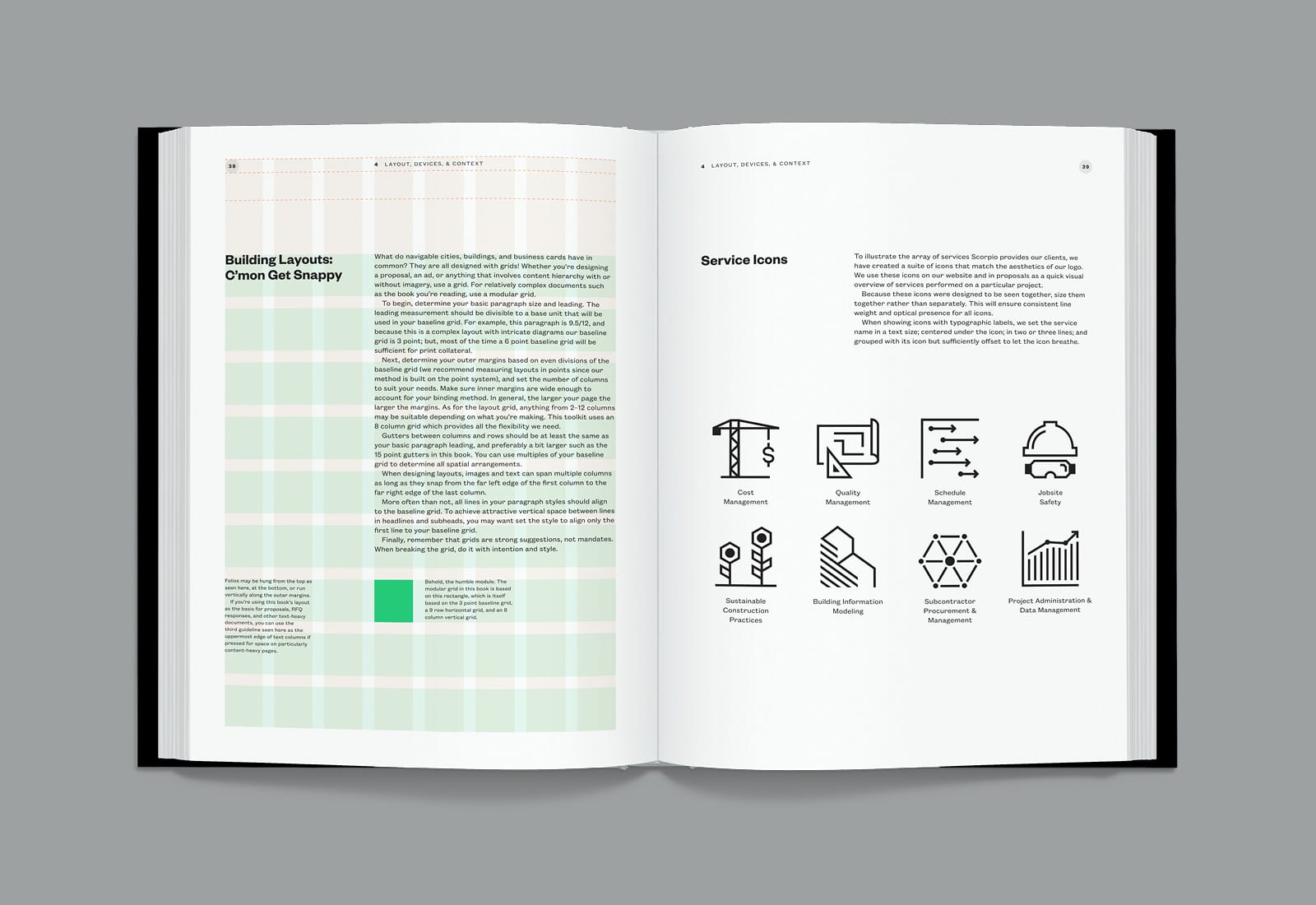
The kit is rounded out by a suite of icons that depict Scorpio’s service offering, and a modular building-block pattern that is equally suitable for presentation covers and subtle textures scattered throughout their website.
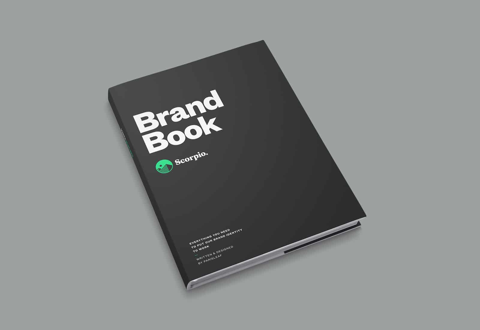
The entire identity was encapsulated with practical guidelines in a comprehensive brand standards manual.
Several spreads from Scorpio’s brand standards manual
Yes, they finally got a new website
Last but certainly not least, we turned our attention to Scorpio’s website. The construction industry is awash in homepages with big photos and boilerplate copy about services and values. Get a little further in, and there are few actual stories about the challenges and solutions teams face on the job.
Our recommendation to Scorpio was to strengthen its brand position through storytelling that evolves. Start building case studies with active projects, add to them over time and send monthly or quarterly updates to email subscribers. We encouraged them to complement those efforts with thought leadership about lessons learned on the job.
Instead of leading with imagery on the homepage and other strategic pages, we draw the viewer in with bold maxims. Full-screen imagery is saved for project pages, and thanks to a modular UI kit those pages can be lean or built up over time into in-depth case studies.
Check out their website to see how it all came together.
Building People
Before work on this project began, the client team told us that if they were going to change they would commit to that change wholeheartedly. They proved true to their word. In the weeks and months following our delivery of their new strategy and identity, the phrase “build people” became a mantra that spread throughout the company. Those simple words were redirecting their thinking toward a clearer focus on mentorship and training the next generation of leaders. Domenic’s last name may still be writ large on their building but as a company, they have begun to embrace the power of “we.”
Shortly after the new website launched and the brand rolled out, we attended an open house at Scorpio’s new digs. The well-appointed space gave the team plenty to smile about. But there was also palpable new energy and elevated pride among the team. As we talked with various teammates, it seemed everyone had absorbed the clarified values and purpose. Even seasoned field staff grinned when they talked about the new logo on their shirts and hard hats. We were reminded that when leaders champion their brand and apply it at every opportunity, the culture of a company can be revitalized from the inside out. And as for the bottom line? Well, let’s just say Scorpio is not starving for projects these days. The company was named to the University of Florida’s 2019 Gator 100, which is a global list of the fastest-growing businesses led or owned by UF graduates. Scorpio landed at 32 on the list, thanks to a steady growth rate of around 50% over the past three years.
Granted, brand development is only one of many factors that have contributed to Scorpio’s success. But what we’ve heard thus far demonstrates that their newfound clarity of purpose and distinctive aesthetic are attracting ideal teammates and clients.
“Creating a true brand identity is no easy task. To do it well takes a team of focused, talented, and experienced professionals. Parisleaf’s unique process and proven methods enabled them to crystallize the essence of Scorpio in very real and tangible ways. They provided a verbal and visual identity that captured why Scorpio exists, who we are, what we believe, and how we are different. We got much more than a new logo. Parisleaf delivered a treasure trove of tools to help team members, partners, and the community at large understand and embrace our “why.” Simultaneously, this system gave our marketing team the ability to work in a more focused, consistent, and intentional way. These tools guide many of our decisions from interior design to proposal generation. From a Marketing Director’s perspective, I can easily say that our brand identity is one of Scorpio’s most valuable assets.”
– Jennifer Denault, Marketing Director